Defining light and dark mode strategy for Amazon Books
Challenge
Amazon Books' reading experience lacked a systematic approach to light and dark mode implementation, creating significant design debt and accessibility concerns. A 2024 audit revealed severe fragmentation in color implementation, with the Kindle iOS app alone containing over 3,000 hard-coded color styles - 64% of which reference basic system colors for critical UI elements.
This fragmentation manifested in several critical issues:
Inconsistent button colors across surfaces (orange, blue, green, gray, white, black, yellow)
No standardization across states or interactions; and missing state designs
Teams creating one-off solutions without alignment to broader vision
Light mode implementations failing to meet contrast requirements
Absence of guidelines aligned with Customer Critical Requirements
Strategic Approach
-
![]()
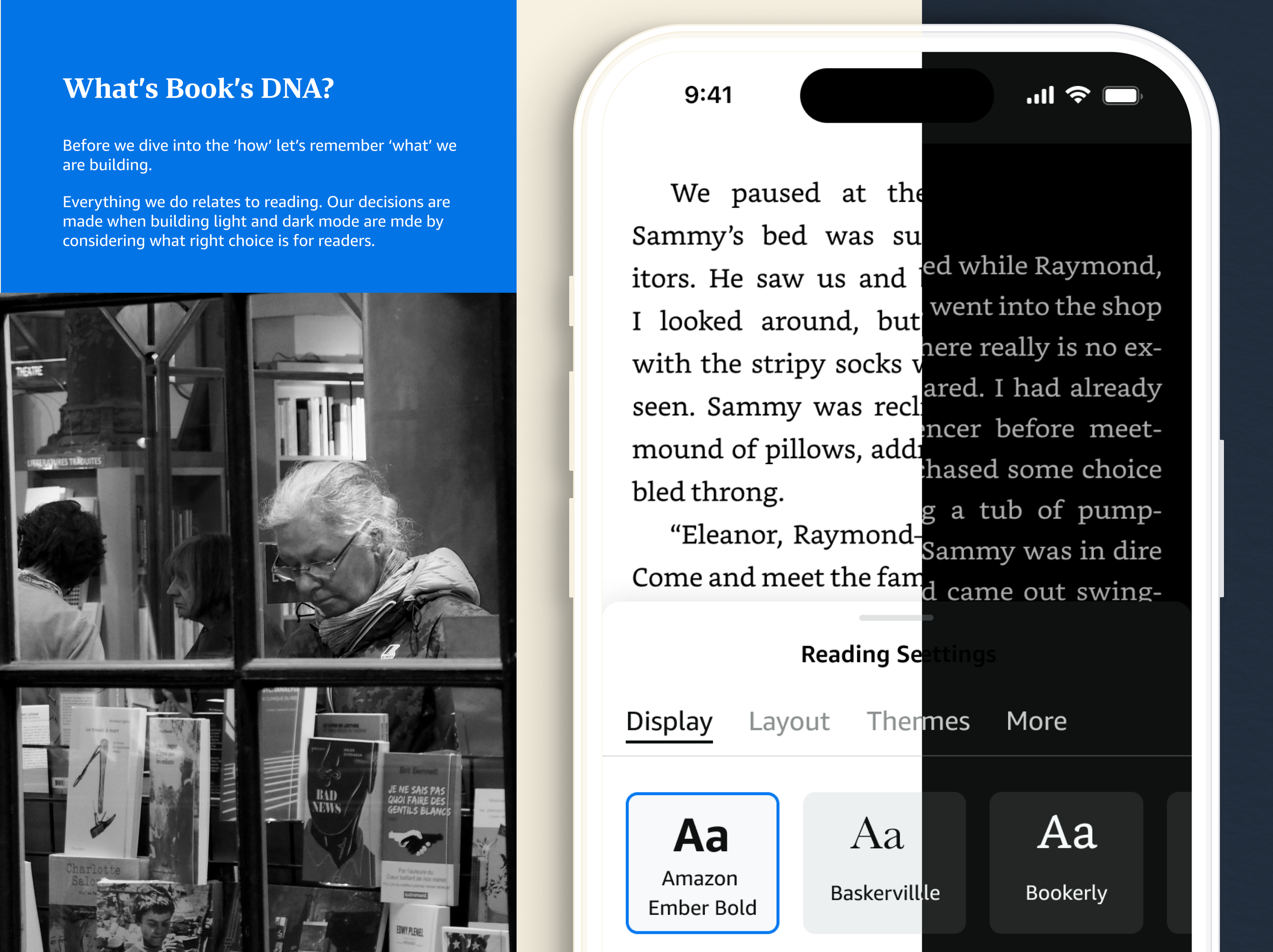
Customer's first
Leaning into the Books experience our customers are looking for, I developed a system-driven strategy built on three core principles: Accessible, Cohesive, Equitable.
-
![]()
Accessible: Ensuring an Inclusive Experience
• Prioritized accessibility in color selection for both modes
• Established strict contrast ratio requirements.
•Incorporated accessibility testing into color definition process.
-
![]()
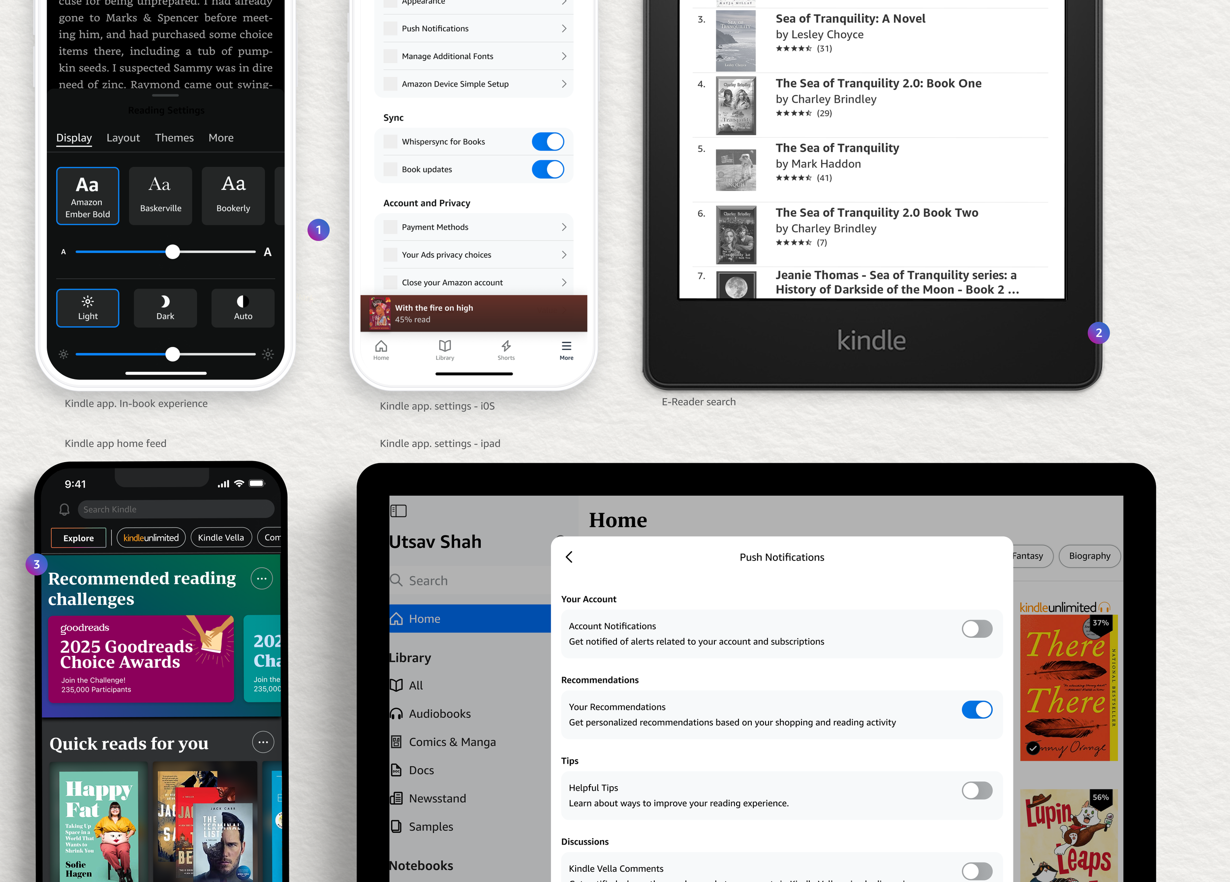
Cohesive: Building "Bookish" Familial Experiences
• Created unified color system maintaining brand identity across modes
• Ensured consistent experience between light and dark reading environments
• Developed color relationships reinforcing the Amazon Books and Rio (Amazon’s shopping design system) relationship
-
![]()
Efficient: Empower Designers
• Developed tools for creating balanced designs in both modes without rebuilding mocks and flows twice
• Established clear principles for color translation
• Partnered with peers to create streamlined Figma workflows


Solution
-
![]()
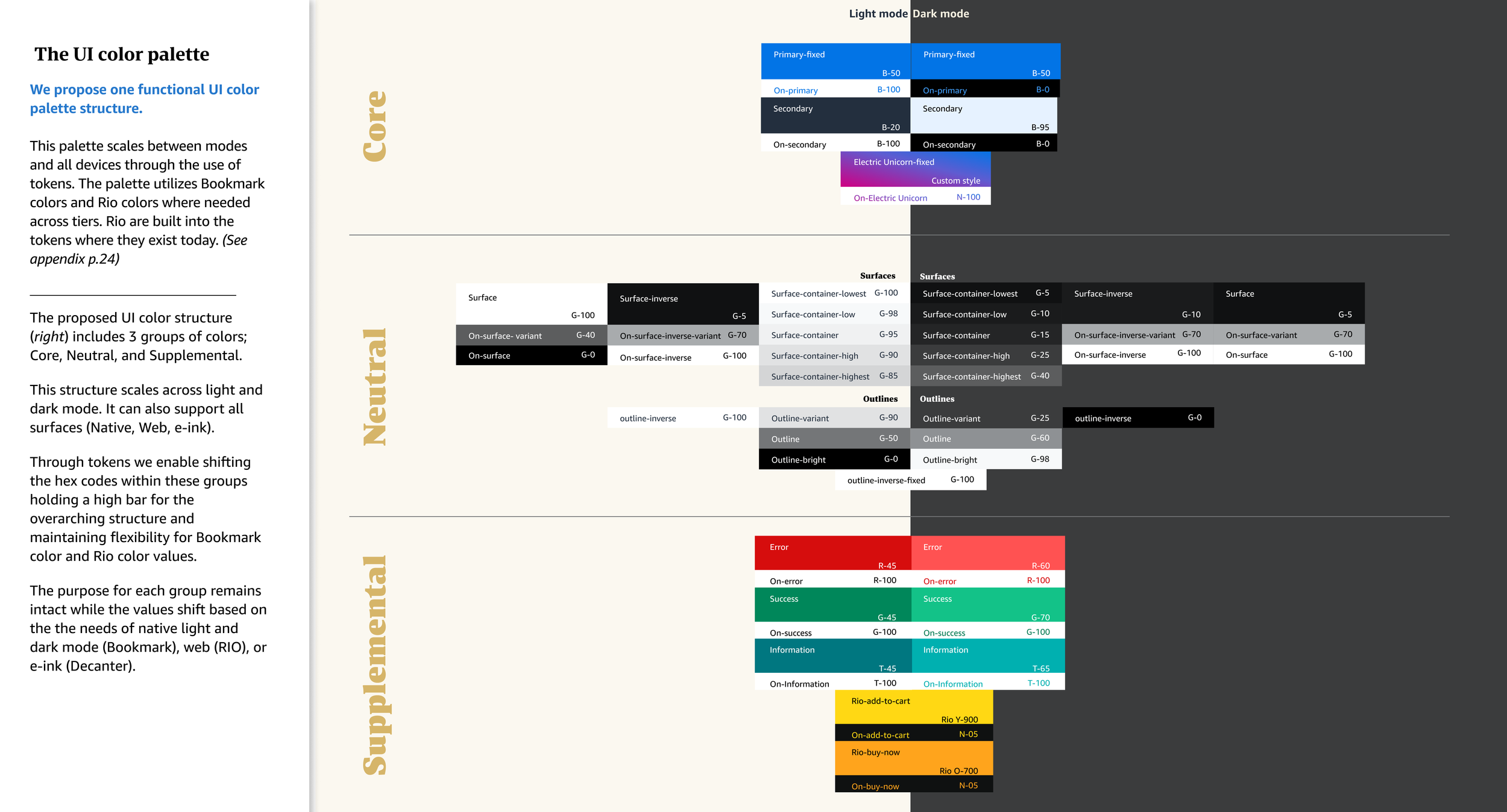
The UI color palette
I developed a structured color system organized into three distinct groups: Core Colors, Neutral Colors, Supplemental Colors.
-
![]()
This tripartite structure:
Scales seamlessly between light and dark modes
Supports all surface types (Native, Web, e-ink)
Maintains consistent purpose while allowing value flexibility
Strengthens visual brand identity across touchpoints
-
![]()
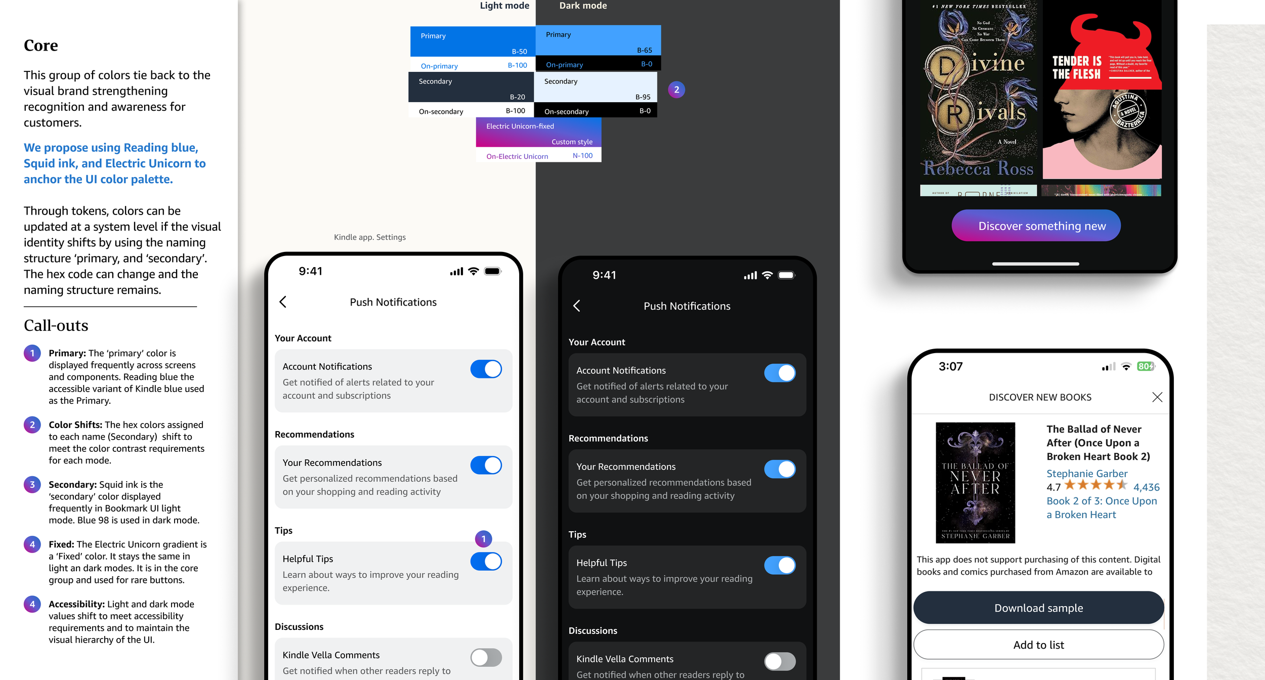
Implementation leverages tokens to enable:
System-level updates if visual identity shifts
Semantic naming structure using 'primary' and 'secondary' designations
Integration of Bookmark colors and Rio colors where needed
First-ever dark mode mapping for Rio colors
-
![]()
Working across Amazon
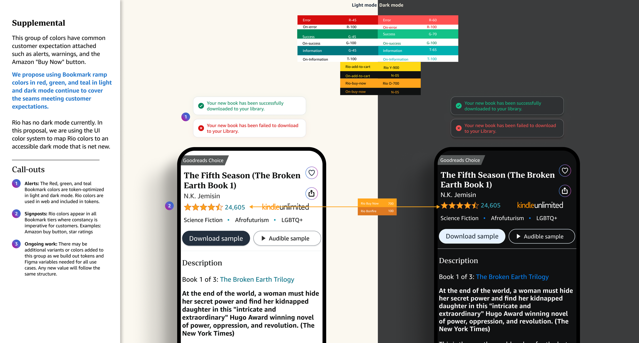
Rio (Amazon core shopping design system) has no dark mode currently. In this system, the UI colors map Rio colors to an accessible dark mode that is net new. This group of colors have common customer expectation attached such as alerts, warnings, and the Amazon "Buy Now" button.

Impact
Technical Achievement:
Created scalable token-based system
Solved critical gap in Rio color system through systematic approach
Enabled building consistent dark mode experiences across reading surfaces (App, e-Reader, and Desktop)
Accessibility Enhancement:
Established accessible dark mode color values where none existed
Ensured consistent contrast ratios across experiences
Met Customer Critical Requirements in both modes
Business Value:
Eliminated need for one-off dark mode solutions
Reduced implementation time through systematic color mapping
Created foundation for future color system evolution
Streamlined designer-to-developer handoff process